Portfolio 2026
A bold visual reset of my personal portfolio — typographic, dark, and unapologetically expressive.
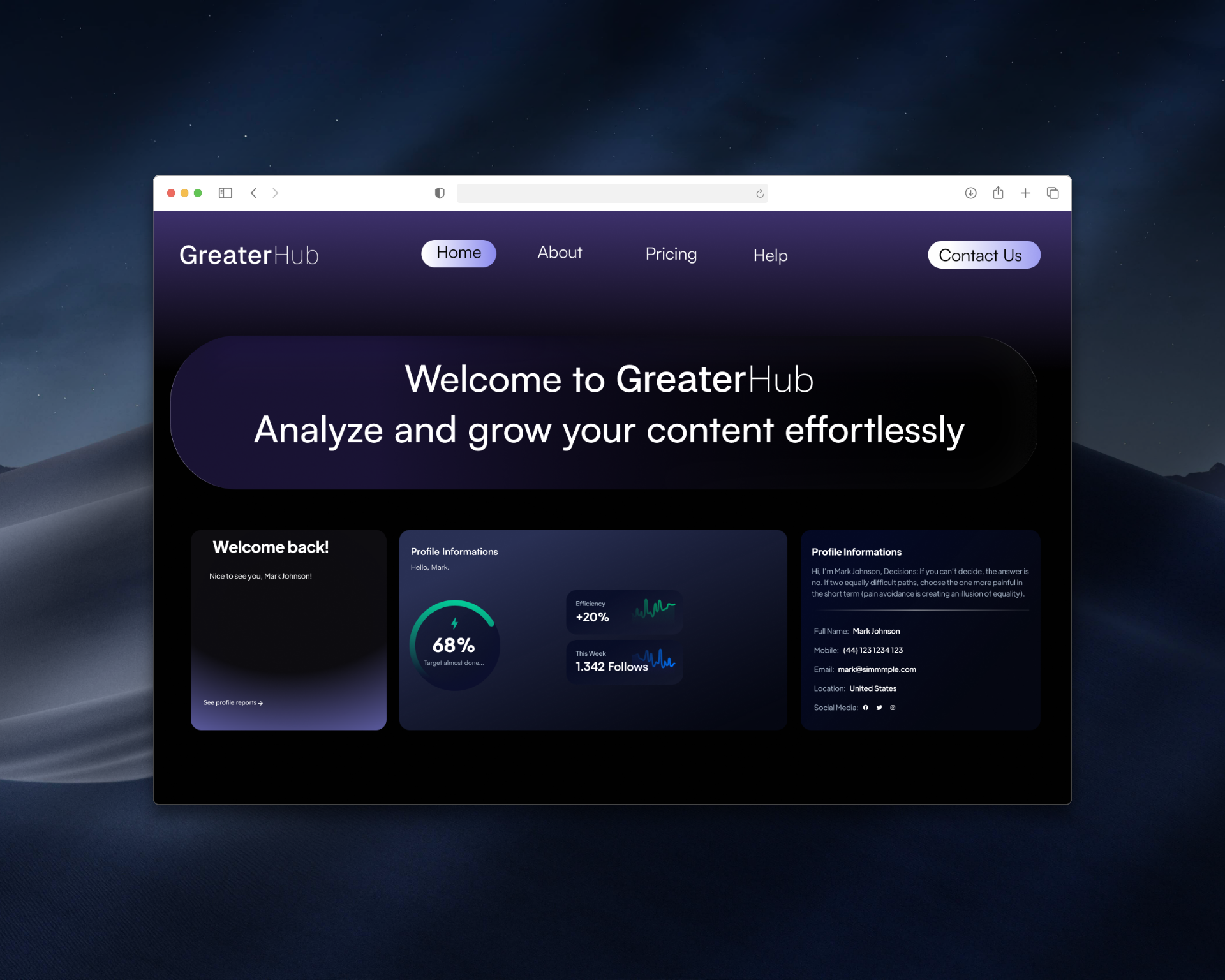
[ N° 02 // Visuals ]
Inside the work.
Drag, swipe or use the arrows to scrub through the project's key frames.

01 / 00
[ N° 03 // The Story ]
From brief
to outcome.
Overview
Portfolio 2026 is a personal exercise in distilling years of work into a single coherent identity. The goal was to design a system that feels editorial, modern and unmistakably mine — anchored by serif display type, generous space and a surgical use of color.
Problem
My old site read like a generic template — it hid the work instead of framing it. I needed a system that could host UI, branding and editorial pieces without each one fighting the others for attention.
Challenge
How do you present a wide range of disciplines (UI, branding, graphic design, web) without diluting the brand? The answer was a strict grid, a single accent gradient, and case-study pages built like long-form articles.
Outcome
A modular, fully responsive portfolio system that scales from a one-line hero to a full case study without breaking visual rhythm.
[ N° 04 // Process ]
Problem
to pixel.
Every project moves through the same spine — research, wireframes, mockups, ship — but the weight on each step changes with the brief.
- 01 · Discover01 / 04
Audit & references
Pulled 40+ portfolio references into a FigJam board, tagged what worked (rhythm, typography, restraint) and what didn't (gradient noise, cluttered grids). Mapped my own archive into 4 disciplines to see real volume per category.
- 02 · Wireframe02 / 04
Low-fi structure
Drafted home, work index and case-study skeletons in greyscale Figma frames. Locked a 12-column grid, the hero scale, and the case-study spine (hero → carousel → story → facts → next) before touching any styling.
- 03 · Mockup03 / 04
Hi-fi visual system
Built tokens for type, color and motion in src/styles.css, then designed three hero variants and converged on the dark editorial direction. Iterated micro-typography until headings sat in the same optical baseline across breakpoints.
- 04 · Ship04 / 04
Build & QA
Implemented in TanStack Start with framer-motion. QA'd contrast, focus states, mobile rhythm and OG share previews on every route before publishing.