PayNova · Fintech App & Web
A modern fintech identity and marketing site for PayNova — a payments product built for speed and trust.
[ N° 02 // Visuals ]
Inside the work.
Drag, swipe or use the arrows to scrub through the project's key frames.
01 / 00
[ N° 03 // The Story ]
From brief
to outcome.
Overview
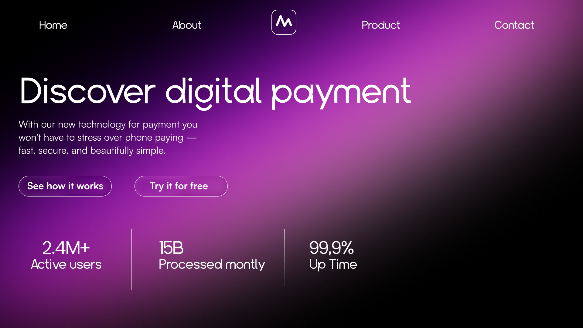
PayNova needed a digital surface that matched the confidence of its product. The site pairs an oversized geometric display face with a deep black canvas and a single magenta-violet aurora to signal a payments brand that's modern, fast and human.
Problem
Payments brands often look interchangeable — same gradients, same dashboards, same 'trusted by' rows. PayNova wanted to stand out in a feed while still reading as a serious financial product.
Challenge
Most fintech sites lean on safe blues and stock dashboards. The brief was to feel premium and a little futuristic without losing the trust signals a payments product needs.
Outcome
A landing flow with hero, an about/product split, a feature trio, and a closing CTA — all carried by one consistent typographic and chromatic system.
[ N° 04 // Process ]
Problem
to pixel.
Every project moves through the same spine — research, wireframes, mockups, ship — but the weight on each step changes with the brief.
- 01 · Discover01 / 04
Brand & references
Audited 20+ fintech and neobank sites, then pulled references from editorial fashion and music posters to find a tone that felt premium without being corporate. Locked three pillars: speed, trust, modernity.
- 02 · System02 / 04
Type & color
Chose a geometric display face for headlines, a clean sans for body, a near-black canvas, and a magenta-to-violet aurora used sparingly to anchor each key section. The accent is the brand — never decoration.
- 03 · Mockup03 / 04
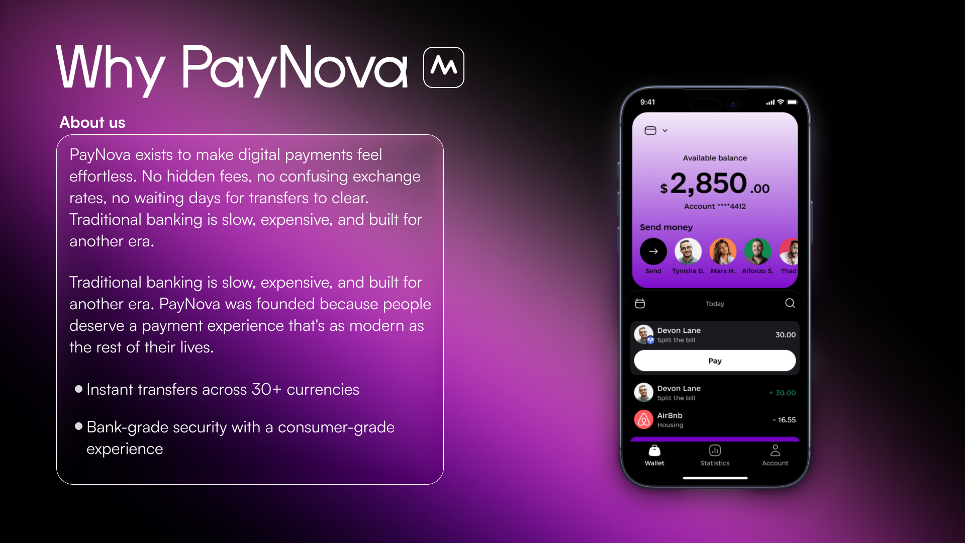
Landing flow
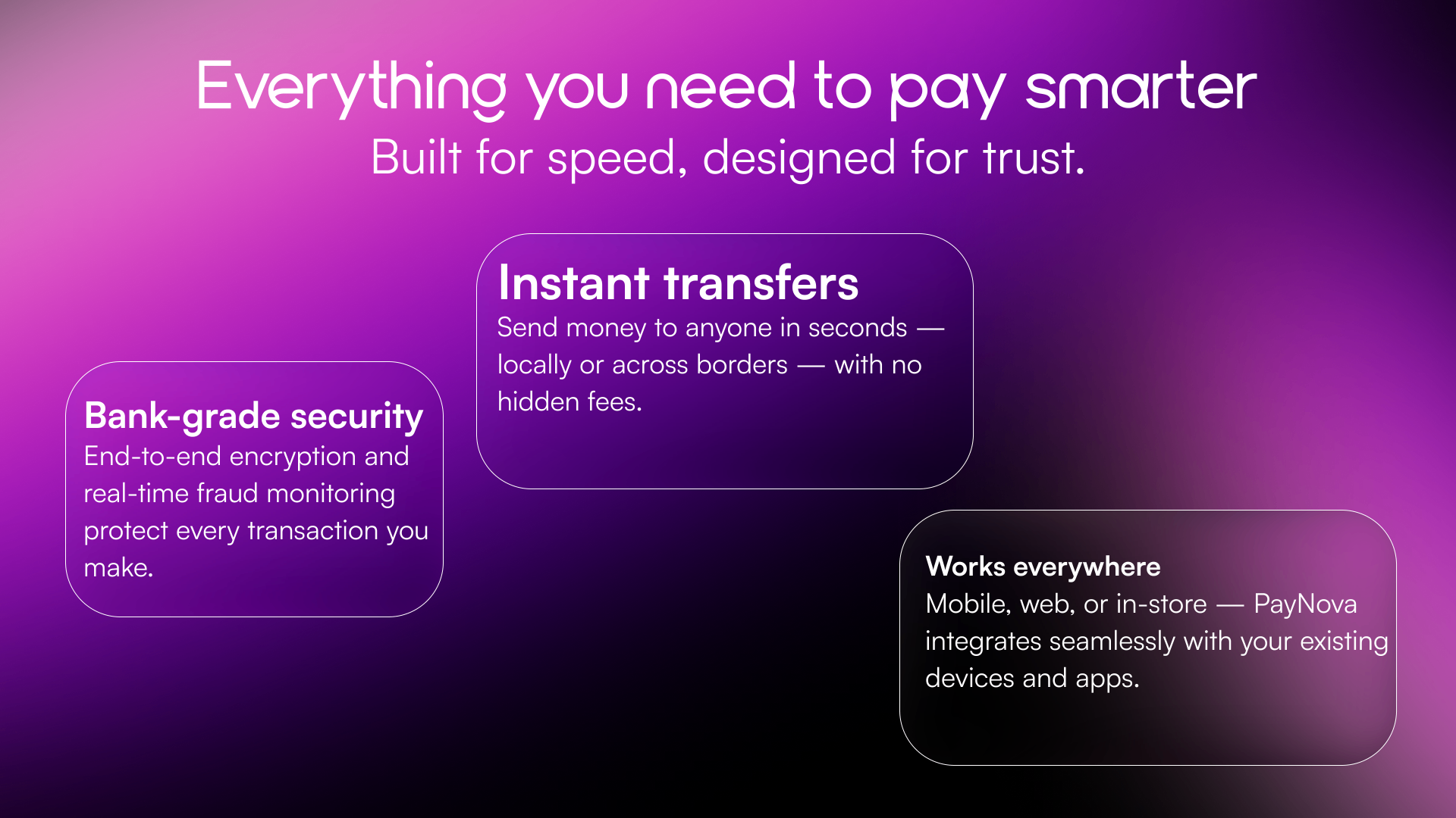
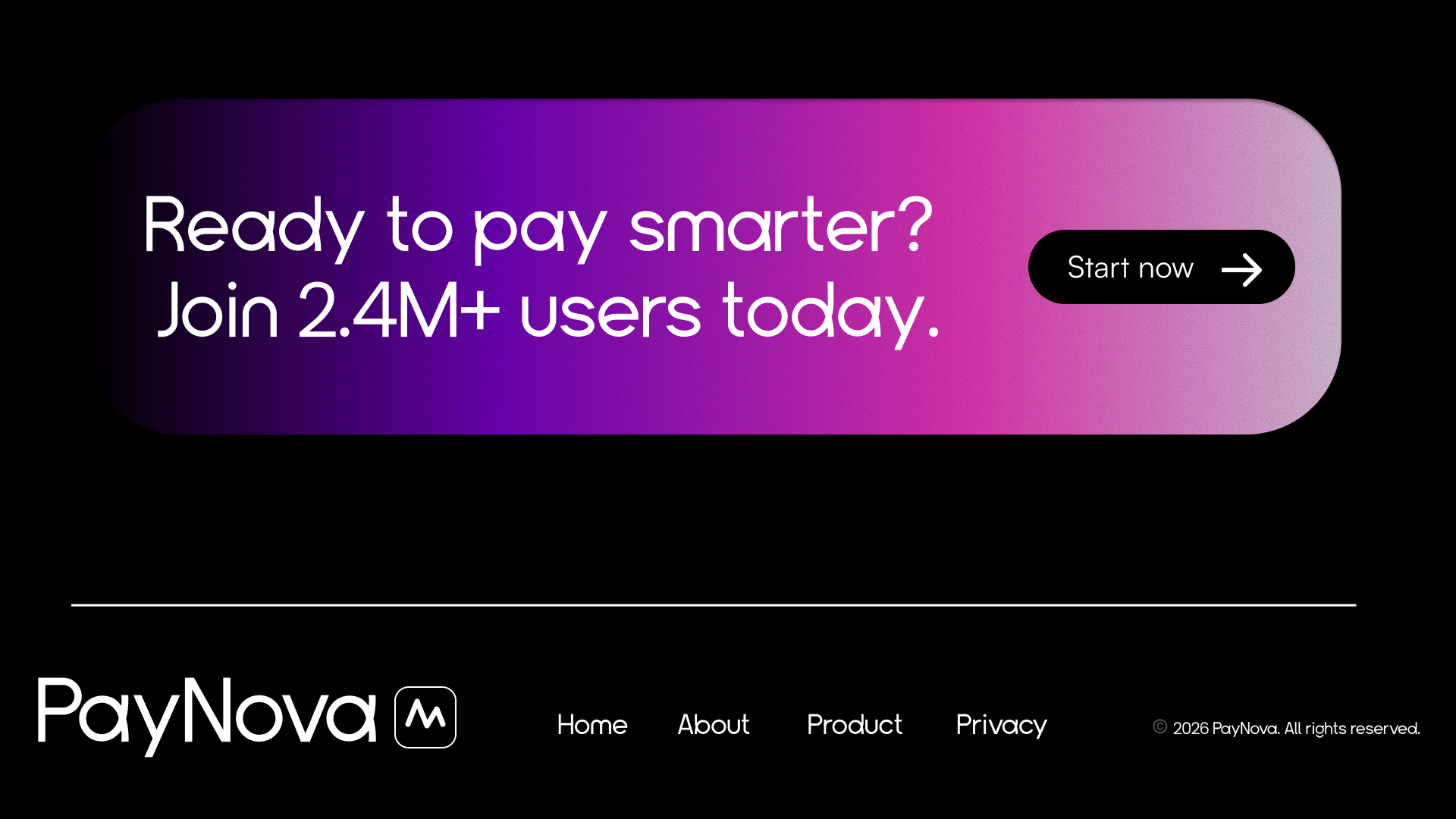
Designed hero, About/product split with a real app screen, a 3-card feature module ('Instant transfers', 'Bank-grade security', 'Works everywhere'), and a closing CTA pill that doubles as a marketing banner.
- 04 · Handoff04 / 04
Extensible system
Documented type scale, the aurora gradient tokens, button states and the section rhythm so future product, pricing and docs pages all read as one continuous brand.
