NTG · Nordic Transport Group
Investor-facing brand surfaces for a Nasdaq-listed freight forwarder — confident, navy-and-lime, built for clarity.
[ N° 02 // Visuals ]
Inside the work.
Drag, swipe or use the arrows to scrub through the project's key frames.
01 / 00
[ N° 03 // The Story ]
From brief
to outcome.
Overview
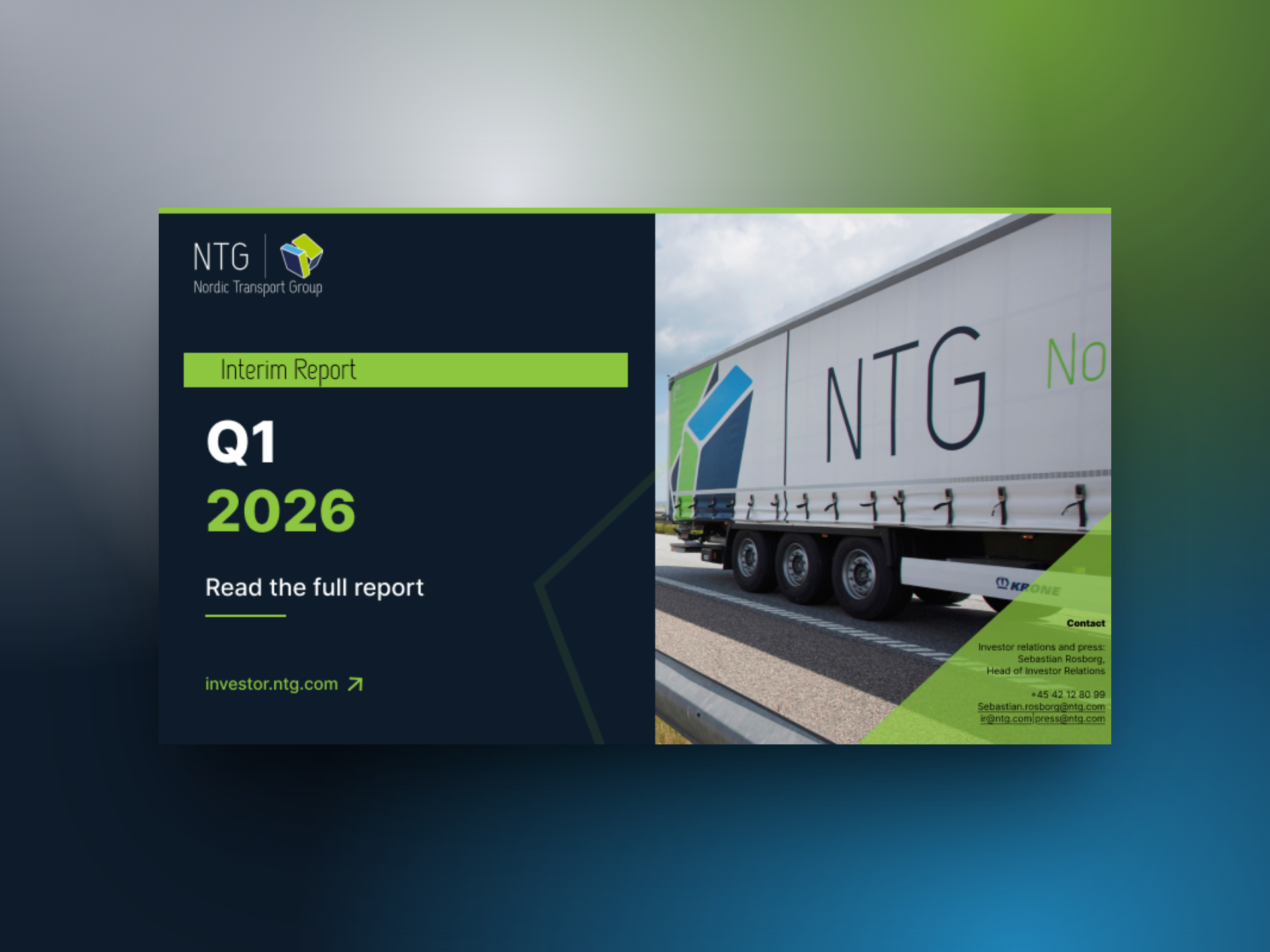
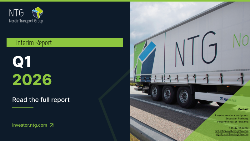
A set of brand and web design pieces for NTG Nordic Transport Group: the About section of the corporate site and two interim-report cover banners for Q1 2026. The system pairs a deep navy canvas with NTG's signature lime to keep dense investor information calm and scannable.
Problem
NTG's investor touchpoints were scattered — the website spoke one language, the quarterly report another, and press assets a third. Analysts and journalists had to re-orient every time they jumped between surfaces.
Challenge
Investor communications usually feel like PDFs in disguise. The goal was to make the corporate story and the quarterly report feel like one continuous brand moment — premium, asset-light, and easy to read on any screen.
Outcome
A consistent visual language across the About page, the Q1 report cover, and a tighter alternative layout — all ready to roll out across investor.ntg.com and press kits.
[ N° 04 // Process ]
Problem
to pixel.
Every project moves through the same spine — research, wireframes, mockups, ship — but the weight on each step changes with the brief.
- 01 · Discover01 / 04
Brand & audience
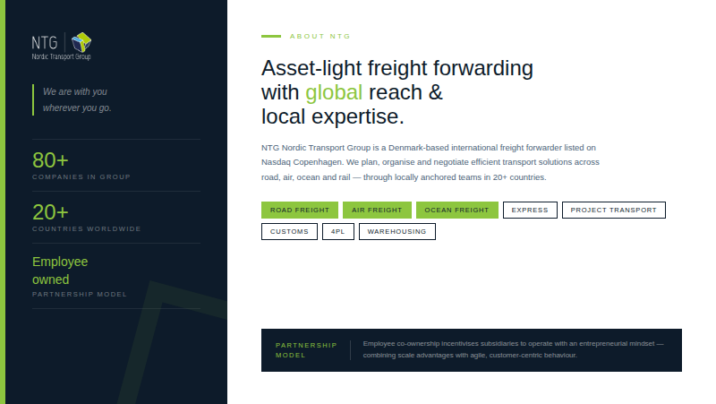
Audited NTG's existing investor materials, annual report, and competitor freight-forwarder sites (DSV, DB Schenker). Mapped the audience triangle — analysts, press, and prospective clients — and identified clarity and credibility as the two non-negotiables.
- 02 · System02 / 04
Navy + lime canvas
Locked a dark-navy primary surface, NTG lime as the single accent, and a clean sans for both display and body. Defined a vertical-rule motif and oversized stat blocks (80+ companies, 20+ countries) to anchor every layout.
- 03 · Mockup03 / 04
About + report covers
Designed the About section as a split layout — credentials on the dark left rail, narrative on the light right — then carried the same brand into two Q1 2026 report cover banners with a freight photograph and an angled lime cut.
- 04 · Handoff04 / 04
Production-ready
Delivered responsive specs, a chip/tag component for service lines (Road, Air, Ocean, Express, 4PL), and editable banner templates so investor relations can ship every future quarter without redesigning.
