Northstone Realty · Web Design
An editorial real-estate site that treats every listing like an architectural portrait — calm, confident, premium.
[ N° 02 // Visuals ]
Inside the work.
Drag, swipe or use the arrows to scrub through the project's key frames.
01 / 00
[ N° 03 // The Story ]
From brief
to outcome.
Overview
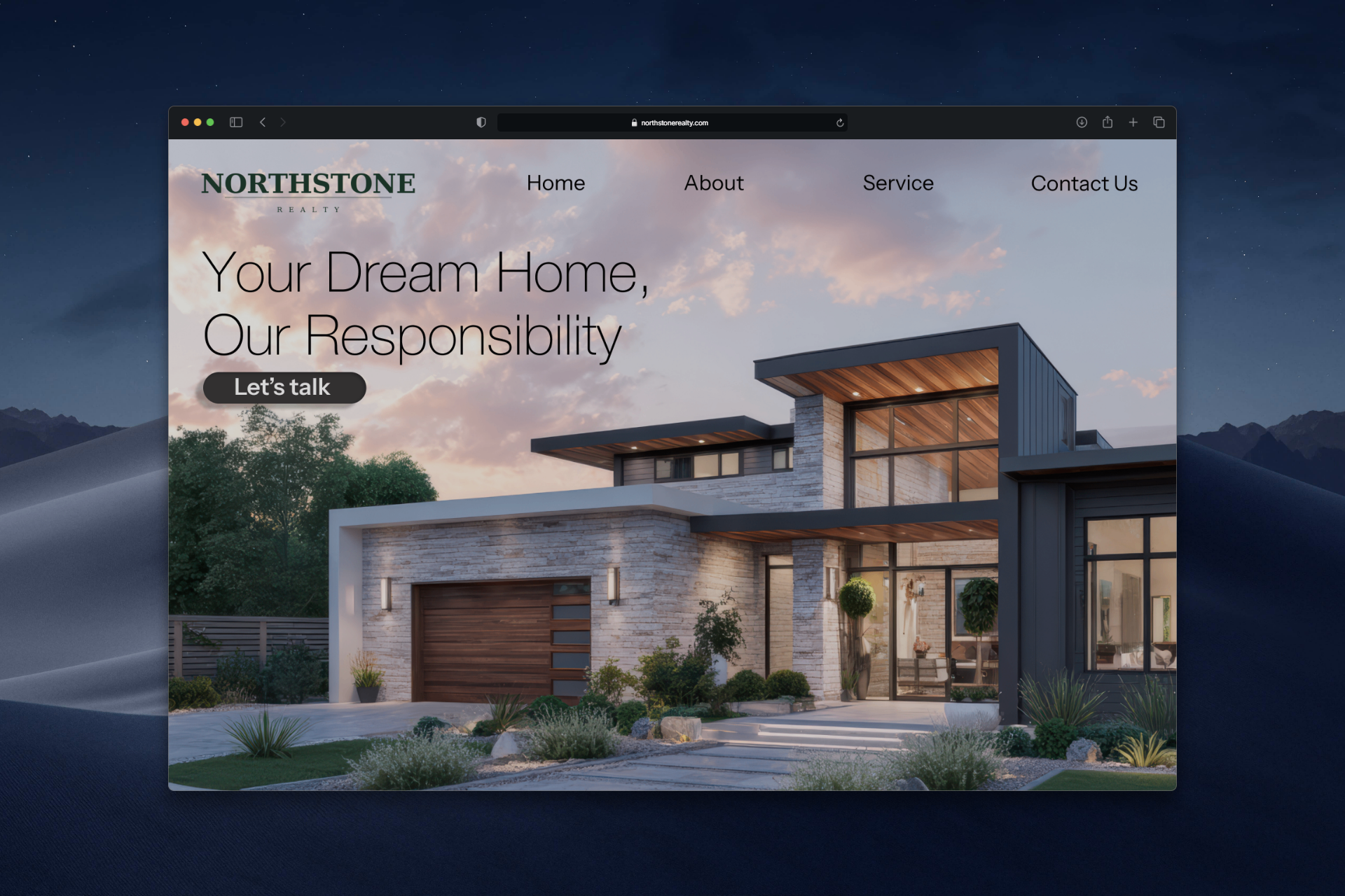
Northstone Realty needed a digital home that matched the quality of the homes it sells. The design pairs an oversized serif headline with a full-bleed hero photograph and a restrained deep-green wordmark, letting the architecture do the talking.
Problem
The category default — busy hero sliders, three-column property grids, neon 'Book a viewing' buttons — was eroding the premium feel that high-end buyers expect. Northstone wanted to look like an architecture studio, not a brokerage.
Challenge
Most realty sites lead with listings grids and aggressive CTAs. The brief was the opposite — slow the user down, build trust through silence and scale, and only then invite them into the catalog.
Outcome
A landing concept with a magazine-grade hero, a clean nav, and a tone of voice ('Your Dream Home, Our Responsibility') ready to extend into listings, agent profiles and a contact flow.
[ N° 04 // Process ]
Problem
to pixel.
Every project moves through the same spine — research, wireframes, mockups, ship — but the weight on each step changes with the brief.
- 01 · Discover01 / 04
Brand & references
Studied premium architecture publications and boutique realty brands. Defined three pillars: silence, scale, and trust — and ruled out anything that felt like a typical MLS portal.
- 02 · System02 / 04
Type & color
Locked an oversized serif display for headlines, a refined sans for nav, and a deep forest-green wordmark as the only color accent on an otherwise photographic canvas.
- 03 · Mockup03 / 04
Hero-first landing
Designed the landing as a single architectural photograph with a quiet headline, a single CTA ('Let's talk'), and a horizontal nav that disappears into the sky of the image.
- 04 · Handoff04 / 04
Extensible system
Documented the type scale, the nav pattern, and the photography rules so future listings, agent bios and contact pages all read as one continuous brand.