PlayHub · Gaming Profile
A player profile redesign for a casual gaming app — XP, badges and challenges pulled into one glanceable hub.
[ N° 02 // Visuals ]
Inside the work.
Drag, swipe or use the arrows to scrub through the project's key frames.
01 / 00
[ N° 03 // The Story ]
From brief
to outcome.
Overview
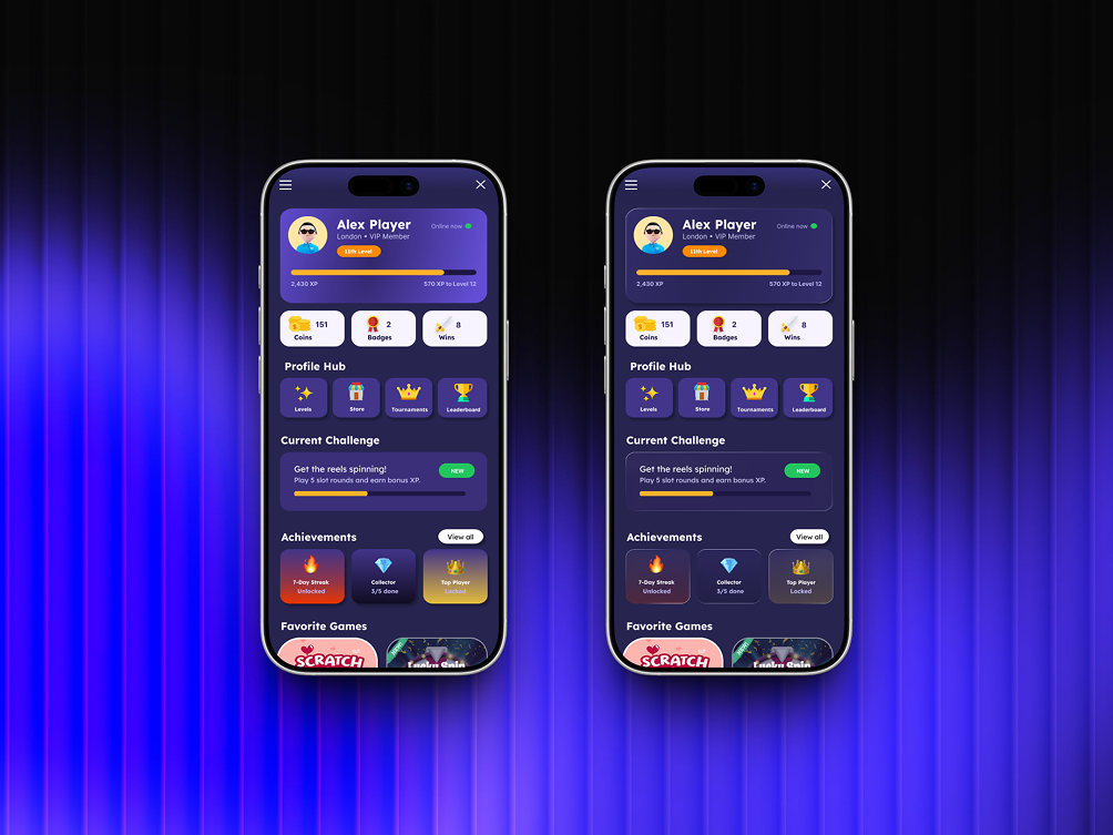
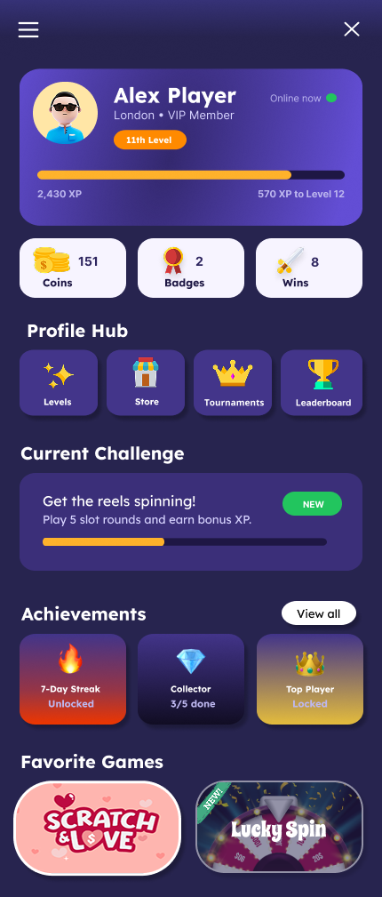
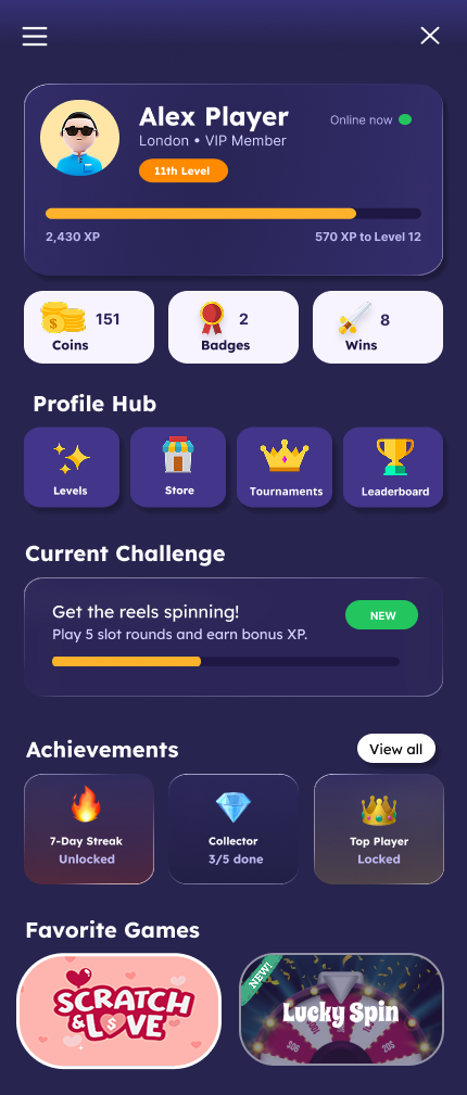
The profile screen collects identity, progression and rewards in a single deep-violet canvas: an XP card with level progress, a coins/badges/wins stat row, a four-tile Profile Hub, the current challenge, achievements and favourite games.
Problem
Progression, rewards and navigation competed for the same space. Nothing told the player what to do next.
Challenge
The original screen buried progression under a list of links. Players couldn't see how far they were from the next level, and rewards had no visual pull.
Outcome
Two explored directions — a saturated gradient version and a frosted-glass version — both keeping the same information hierarchy so the team could A/B the visual register without redesigning the flow.
[ N° 04 // Process ]
Problem
to pixel.
Every project moves through the same spine — research, wireframes, mockups, ship — but the weight on each step changes with the brief.
- 01 · Audit01 / 04
What players look for
Ranked profile content by how often it's checked: level and XP first, coins and badges second, navigation third. The layout follows that order top to bottom.
- 02 · Structure02 / 04
Cards and lanes
Grouped everything into rounded cards — an identity card, a three-up stat row, a four-tile hub grid, then horizontal lanes for achievements and games.
- 03 · Direction03 / 04
Gradient vs glass
Built two visual treatments on the identical structure: a bold gradient version for energy, and a translucent frosted version for a calmer, more premium feel.
- 04 · Polish04 / 04
Reward moments
Unlocked achievements get warm gradients and locked ones desaturate; the challenge card carries a NEW pill and its own progress bar so there is always a next action.